UCSF Health Site Map Redesign
A case study on the information architecture of the University of California, San Francisco Health website.

Case Study
My Role: UX Researcher
July 2019 – August 2019
Introduction
Findings from two studies in the Journal of the American Medical Informatics Association (2014) and the Journal of Medical Internet Research (2015) which analyzed the data from the 2009 and 2011 National Health Interview Study (NHIS), respectively, found that people with healthcare access barriers outside of insurance issues are more likely to use the internet to access general healthcare information and services. Meaning, it is imperative that large health providers and organizations make their information easily accessible on their internet platforms.
Through Card Sorts and Tree Testing, I analyzed University of California, San Francisco Health (UCSF Health) website and identified issues in the discoverability of key healthcare information on the site.
IMPACT: By reworking the information architecture of the UCSF Health site map, and removing UCSF Health “branding jargon,” discoverability of key information increased for new users.

Why Information Architecture?
Information architecture (IA) makes order of mess. It allows users to understand what is there, what else they can find, and what else to expect in a way that is easy and intuitive for the target user. A good IA should help to guide the user for a seamless user experience.
See more from the usability.gov website
Current UCSF Health Site Map
(as of time of study)

Assumptions
Jargon is going to be a barrier in whether users can access certain information
Lack of grouping which fits the user’s mental model is going to limit how directly users can find information
RESEARCH
Tree Testing
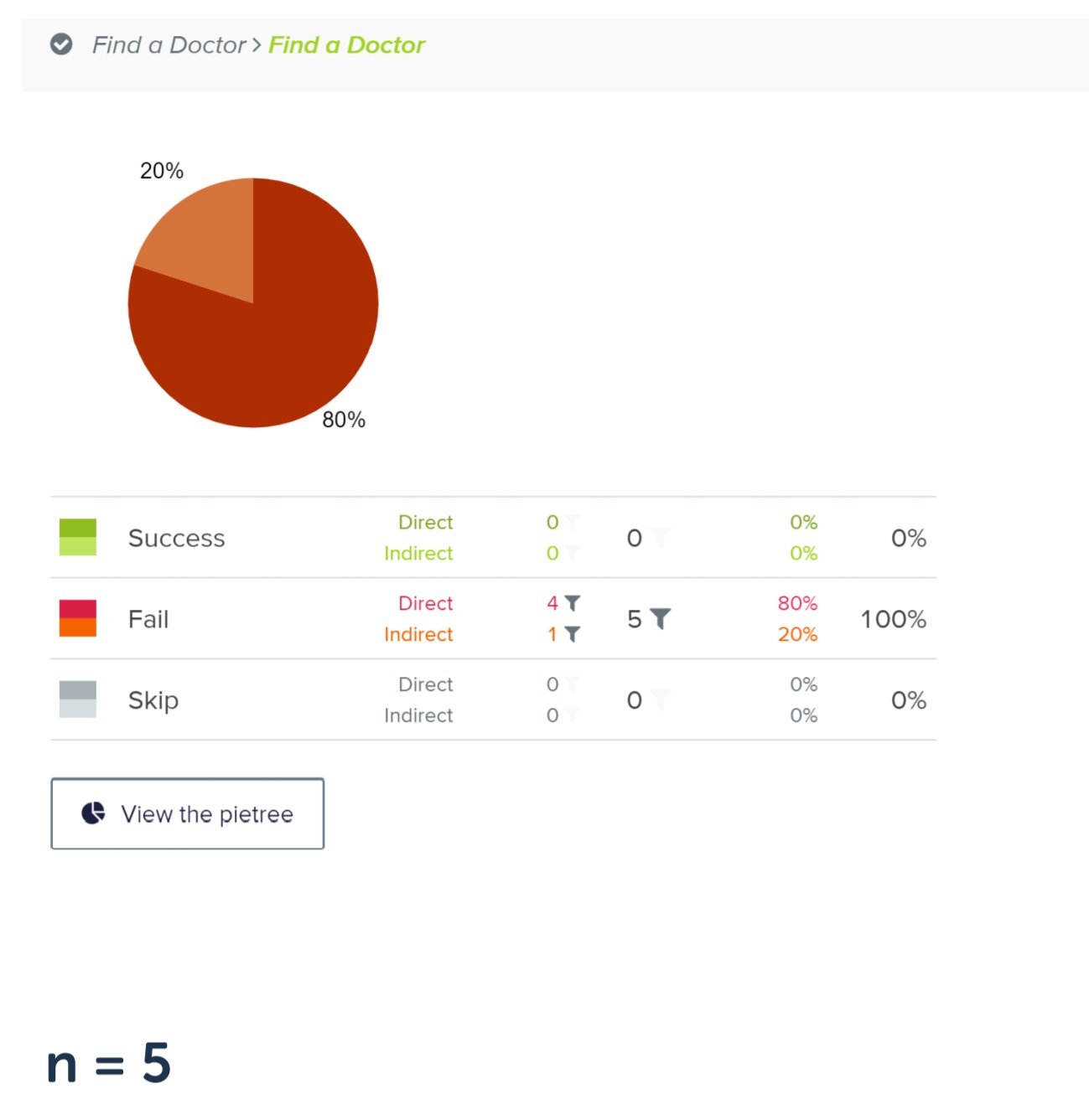
I conducted a tree test on 5 new users using the current UCSF Health site map to work out if users could find information and complete 25 tasks.
Key Findings
Discoverability of patient directed information is poor

Participants had little to no success in locating information for them. For example, no participants were able to locate where the information for finding a doctor was despite this information being labeled as “Find a Doctor.” This suggests that groupings of information may not fully meet participant expectation or mental models, thus making discovery of information not easily accessible.
Participants had difficulty locating information in a direct way

When participants were able to find the tasked information, they were not able to locate this information in a direct way which may be due to unfamiliar vocabulary.
Card Sorting
I then took all tasks and had 7 participants group them into categories to gain a better understanding on potential user’s mental models.
Key Findings
Participants all created at least two groups based on what they believed was information for a patient and what information was for a provider

Site Map Redesign

From the above data and findings, I adjusted the information architecture and reorganized the site map design. Duplicate information was condensed and labels were reworded to better represent their intended information.
Validating New Site Map
I conducted a second tree test study, using the exact same tasks, with 6 new participants to validate whether the redesigned IA does improve discoverability and accessibility of information.

Rewording labels to better represent vernacular that users would more easily recognize helped to increase participant’s abilities to more directly find information.
There was an overall increase in participants succeeding in finding core tasks as well as an increase in participants directly accessing tasked information by as much as 80%.

Learnings
Cutting down on “jargon” in labels makes key tasks more discoverable for new users. In turn this keeps discoverability high for established users.
For more key findings and learnings please contact Elyssa Tong (portfolio owner).
Next Steps
