Developing the Sodagreen Website
Designing and developing a website for the Taiwanese indie-pop band, Sodagreen. The purpose of this project was to ideate, design, and code a hosted and fully interactive website.

UCBX Web Development and HTML5 and CSS Final Project
October 2020 - December 2020
My Role: UX Designer, UI Designer, and Web Developer
Introduction
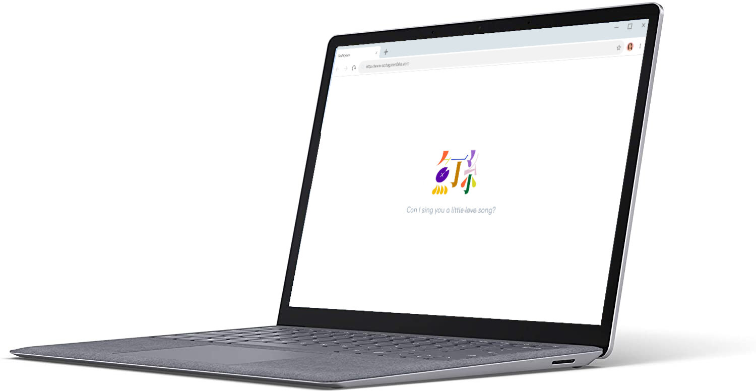
This was the final project for the University of California, Berkley Extension’s Web Development and HTML5 and CSS class. This was an elective class to help designers build good foundations in web development and coding languages, and to develop an understanding of the skills and work needed to bring to life the designs which we create.
The purpose of this project was to design, develop, and fully host a website for a musical band of our choice. Below is my process for developing a website for the Taiwanese indie-pop band, Sodagreen.
Background

Image depicting the band Sodagreen (source: Wikipedia)
Sodagreen is a Taiwanese, indie-pop band. Having formed in their college years at the start of the century, the band has become one of the most successful indie acts to come out of Taiwan. They boast a prolific and diverse discography. From guitar ditties to sweeping symphonic soundscapes, Sodagreen have maintained a recognizably quirky and melodic sound throughout their career. As an avid fan, I chose to design a site for this band in order to challenge myself to translate these recognizable elements of their music into a digital web space.
— Project Criteria —
Below is a list of minimum requirements which the website needed to fulfill. Some of these criteria ranged from requirements for specific design elements (e.g. having the Homepage be a splash page utilizing a single image) to criteria that allowed for much more design freedom (e.g. the Discography page just needing to include a certain number of albums).

Image is the full list of requirements provided for the project
— Design —
Wireframes
I aimed to portray a minimal, and harmonious structure to each webpage, structuring most images and text on the page as centered or adhering a “rule of thirds” format in order to create a feeling of balance. This minimal structure also meant that high content pages (e.g. the Discography page and Media page) needed to be able to portray this information without cluttering or overwhelming the user. After sketching a few low-fidelity wireframe ideas, I decided that the best way to maintain this was to hide content in carousels.

Image of initial wireframes created in Figma
Fonts and Colors

Sodagreen logo with color and font guide
Colors
From the beginning, I knew that the best way to translate the band’s fun and bright personality was by drawing inspiration from their logo. I chose the light green and orange colors to denote clickable and active buttons as these were the colors that can be seen accenting the book-ends of the logo. While the primary text colors were originally taken directly from the shades of purple seen in many of the logo’s major shapes, but were then fully desaturated so as not to overpower the brightness of the green and orange.
Font
I continued to take inspiration from the logo when choosing a primary font for the site. Where the scaffolds of the site are very structured (as seen in the wireframes), I wanted a rounded, almost cartoon-like, font to represent the curved shapes utilized in the band’s logo.
— Iterations —
Coding and Troubleshooting
Once I began developing my design, where I found myself spending a majority of my time was in the carousels. While I was able to easily create a carousel that, at face value, looked like how I had designed them, they did not function at all like how I needed them to function. I read different tutorials and analyzed the code of different carousels on the internet, and even consulted with a professional web developer, to understand where my code may have been encountering errors.

Image of my “test.html” and “test.js” where I would troubleshoot different code
Redesigning the Discography Page

Around one week before the deadline of the final site, an additional criterion was added to the parameters: allow for music tracks to be played directly on the Discography page. My original design and code had not accounted for this criteria and so I returned to my original designs to find ways of incorporating this new parameter without changing the design too much, so as not to cause development to go over the deadline.
I looked into several ways to allow music to play on my site and decided to embed the Spotify player into my HTML. I then sketched a couple of paper wireframes to figure out the best way to present that in my design and before reworking the code to accommodate this new design element.
— Final Website Design —
Below are a demonstration of the main features of the site.
Click here to experience the full website
Landing Page
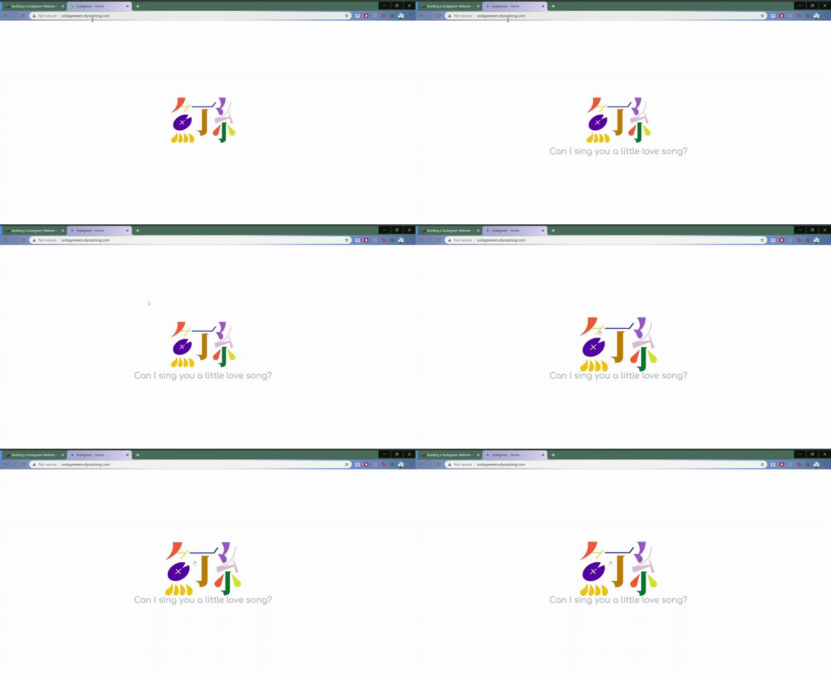
For the splash page, I used the band’s logo and the tagline, “Can I sing you a little love song?” to invite in users. As it is not immediately apparent what it clickable on the site, I coded it so that the clickable image not only pulses when the page first loads, but that the image enlarges when hovered over by the cursor.
Discography Page
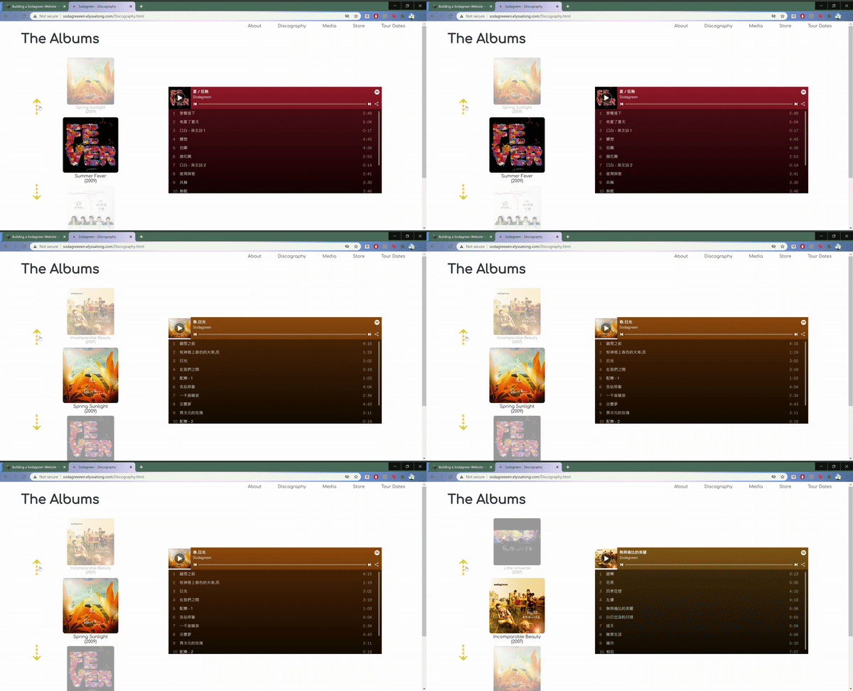
After clicking on the the logo on the Landing Page, the user is redirected to the site’s Discography Page to fulfill the user expectation that, if the Landing Page is asking “can I sing you a little love song?” the next interaction would include music.
On this page the user can then scroll through the band’s many albums using the vertical carousel on the left, and play previews of the songs with the Spotify player on the right.
About Page
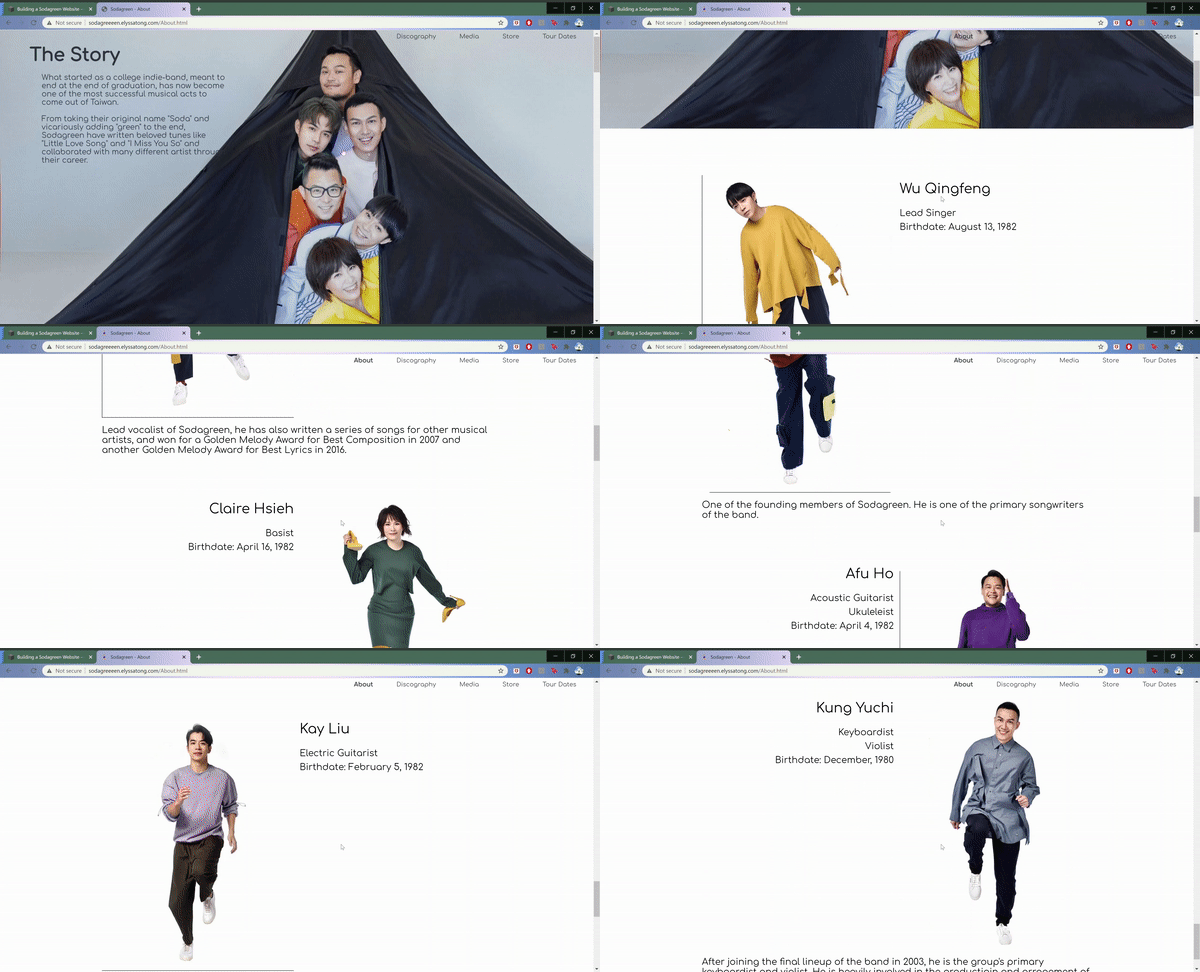
The about page is definitely the least interactive page on the site. I utilized a two column structure to code the a simple layout to organize the descriptions of the band members.
Media Page
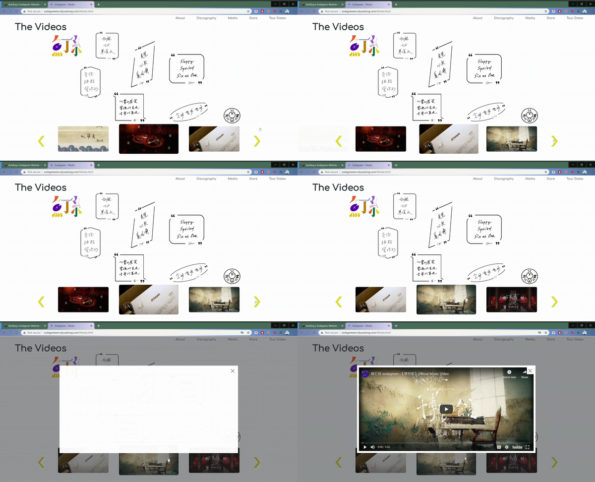
The Media Page is focused on the band’s music videos which users can scroll through using the carousel at the bottom. When clicked, these videos appear in a light box on the screen for the user to watch.
Additionally, while the main focus of the page are the videos, in order to incorporate the criteria for the media page also needing to have 8 images which can expand into a lightbox display, I made the background image of the Media Page interactive, allowing users to discover secrete images on the page.
Store Page
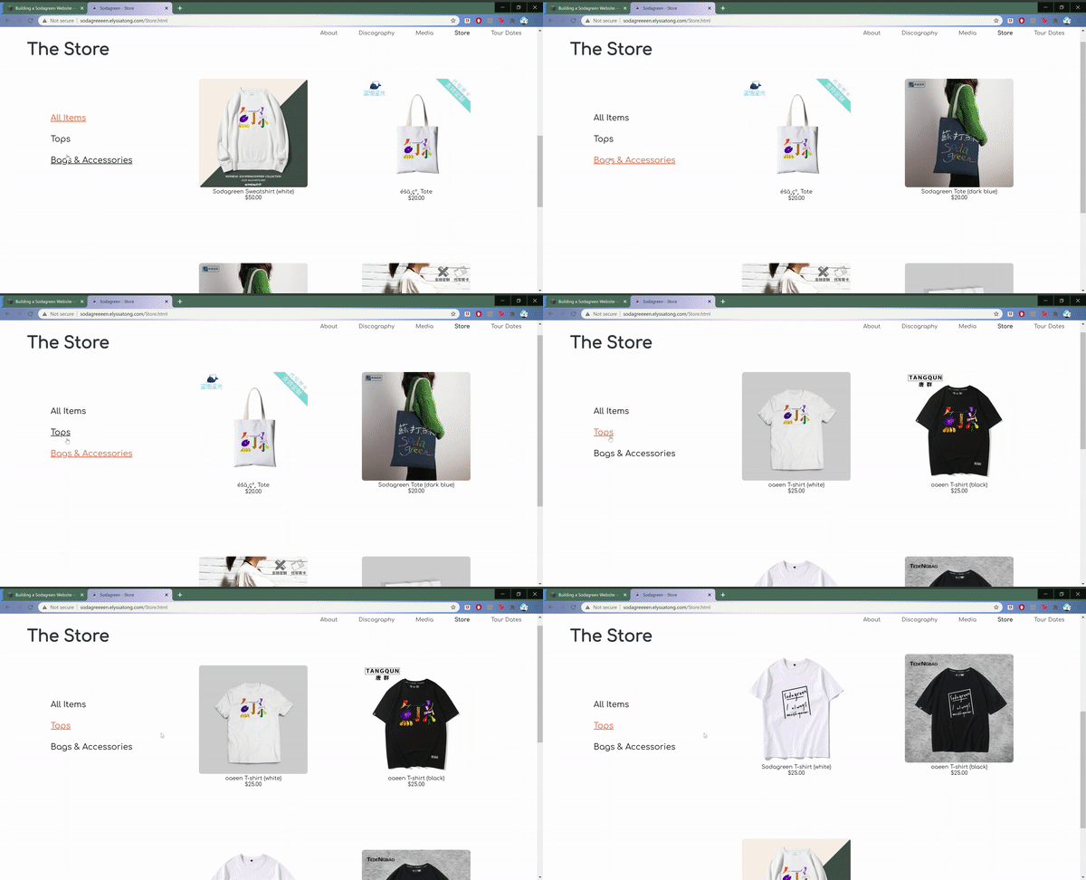
This page allows users to filter through the different merchandise* on the site using the menu options on the left-hand side of the page.
*Note: For purpose of the project, no items are actually clickable.
Tour Dates Page
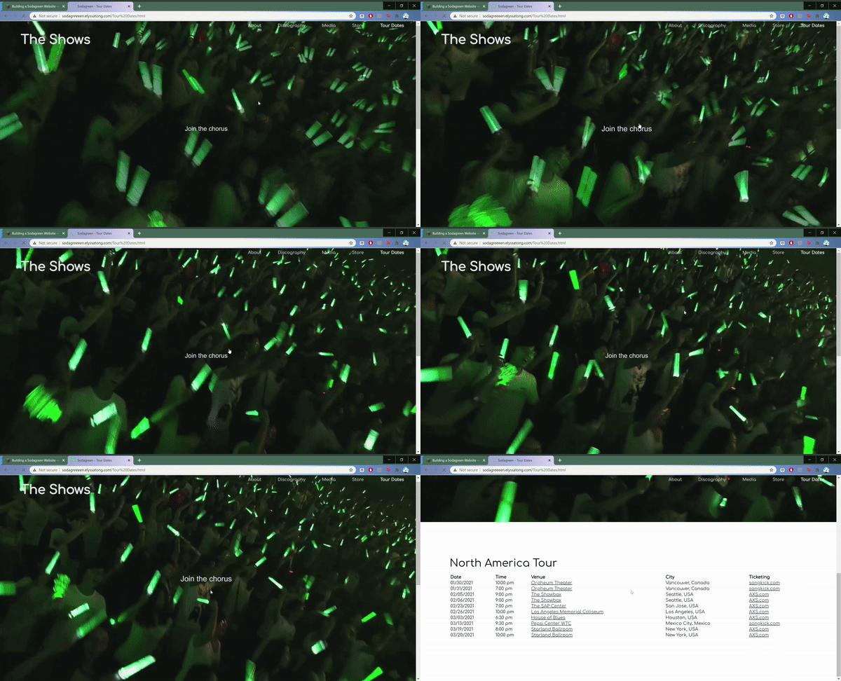
The Tour Dates Page is set up similarly to the landing page, in that it includes a single moving image with the clickable prompt “Join the chorus.” After clicking this prompt, the page then scrolls to the portion of the page which lists the locations, times, and venues for the band’s tour*.
*Note: All dates and times were made-up for the purpose of this project.
— Retrospective —
Errors and Limitations
No user testing was done at any point during this process. The lack of user testing became evident after the launch of the site when it became very obvious that user expectations of what was clickable and interactive on the site was different than the function. In particular, the green arrows that often denoted clickable buttons was not immediately obvious to users who assumed that the green arrows on the carousel were merely instructional. How users assumed the design of the carousel worked was by swiping on the media images.
Had I’d done a quick 15-minute user study on 3-5 participants, showing them images of my intended design and asked participants what they thought was clickable and what interactions could occur on the page, I could have then adjusted the UI and interaction design to better match these user expectations. This way it could have saved time trying to fix these issues that could have easily been avoided, and avoided the risk of spending hours developing a product that isn’t as functional as it could have been.
